
When a site grows past 30 or 40 pages, a standard dropdown stops working. Links get buried three levels deep, users hover their way into dead ends, and important sections never get seen. That is the problem a mega menu solves: it flattens deep structures into one visible panel so people can scan instead of dig.
Below are 8 mega menu design examples broken down by layout structure, not by brand name. For each one you get the content depth it fits, the recommended column count, the right trigger behaviour, and the mobile fallback that keeps it from collapsing on small screens.
What Counts as a Mega Menu (and What Doesn’t)
A mega menu is a large, panel-style dropdown that shows multiple groups of links at once, usually with headings, and often with icons, images, or short descriptions. Nielsen Norman Group research has backed this pattern for years for one core reason: it makes options visible instead of hidden behind scrolling or repeated hovering.
What it is not:
- A single vertical list of 15 links (that is a long dropdown, and it is hard to scan)
- A cascading fly-out with three levels of hover (high error rate, poor accessibility)
- A full-screen overlay menu with only 5 top-level items (that is an overlay nav, useful but a different pattern)
When You Actually Need One
| Site size | Recommended navigation |
|---|---|
| Under 15 pages | Flat top nav, no dropdowns |
| 15 to 40 pages, 2 levels | Simple dropdowns, 1 column each |
| 40 to 300 pages, 3 levels | Mega menu, column-based or grid |
| 300+ pages, deep catalog | Mega menu with a vertical category rail plus search-first entry |

The 8 Mega Menu Layouts, Explained
1. The Column-Based Layout (the workhorse)
Three to five vertical columns, each with a bold heading and 4 to 8 links underneath. Nothing else. This is the layout you see on SaaS sites, universities, banks, and B2B service companies.
- Fits: content that already groups naturally (Products / Solutions / Industries / Resources)
- Column count: 3 to 4 is the sweet spot; 5 is the ceiling on a 1280px viewport
- Links per column: cap at 8. If a column needs 12, you have two categories pretending to be one
- Trigger: hover with a 150 to 250ms open delay on desktop, click on touch and keyboard
- Mobile fallback: stacked accordion, one category open at a time
The reason it works: the eye reads column headings first, treats each column as a mini page, and ignores the rest. That is fast scanning with almost no cognitive load.
Common mistake
Uneven column heights. If column one has 9 links and column four has 2, the panel looks broken. Rebalance the taxonomy or add a filler block (a promo card, a support link, a contact CTA) to the short column.
2. The Category Grid Layout
Instead of columns of text links, you get a grid of tiles, each tile being one category with an icon and sometimes a one-line description. Think 2×4 or 3×3 blocks.
- Fits: feature-heavy products where each item needs a label plus explanation (“Analytics: track events across every channel”)
- Grid size: 6 to 9 tiles. Beyond 12 the grid loses its scanning advantage
- Trigger: hover-open, but make the whole tile a click target, not just the title text
- Mobile fallback: single-column list with icons kept, descriptions truncated to one line or removed
Grids beat columns when the label alone is ambiguous. Descriptions cost vertical space, so budget them: 40 to 60 characters per tile, no more.
3. The Two-Panel Layout (category rail plus content pane)
A vertical list of parent categories sits on the left. Hovering or clicking one loads its children into the larger right-hand pane. This is the standard for large ecommerce catalogs.
- Fits: deep catalogs with 8 to 20 top categories and 10+ subcategories each
- Structure: left rail 20 to 25% width, content pane 75 to 80%
- Trigger: the top-level opens on hover, but the left rail items should respond to hover and arrow keys, with a visible active state
- Mobile fallback: drill-down navigation. Tap a category, the panel slides left, a persistent “Back” row appears at the top
Rule for this layout
Always make the left-rail parent item clickable to its own landing page. Users who want “all Kitchen” should not be forced to pick a subcategory.
4. The Featured Content Layout
Two or three link columns on the left, plus a highlighted block on the right: a new release, a webinar, a case study, a seasonal collection.
- Fits: sites with an editorial or marketing calendar, where something new needs promotion every few weeks
- Ratio: keep the featured block under a third of the panel width so it never competes with navigation
- Trigger: hover on desktop is fine, but never auto-play video or animation inside the panel
- Mobile fallback: move the featured block below the link list, or drop it entirely. It is the first thing to cut
One caution: featured blocks age. If nobody owns the update schedule, you will be shipping a mega menu that still promotes last quarter’s launch. Assign an owner before you build it.
5. The Image-Led Layout
Visuals carry the navigation. Each item is a product photo or collection image with a short caption underneath.
- Fits: fashion, furniture, travel, food, anything where the product is the decision
- Item count: 4 to 8 images maximum. Images are heavy visually and in bytes
- Performance rule: lazy-load images and preload only the first panel; serve at 2x display size, not full resolution
- Trigger: click is often better here, because hovering over a rich visual panel by accident is jarring
- Mobile fallback: horizontal scroll strip of thumbnails, or a text list with small thumbnails at 48x48px
6. The Tabbed Mega Menu
One panel, multiple tabs inside it. The user opens “Products” and sees tabs like By Use Case / By Industry / By Platform, each swapping the content underneath.
- Fits: sites where the same content needs multiple entry logics (audience-based and product-based at once)
- Tab count: 2 to 4. Five tabs inside a dropdown is a small site pretending to be simple
- Trigger: panel on hover, tabs on click only. Hover-switching tabs feels twitchy and unstable
- Mobile fallback: flatten the tabs into sequential accordion sections. Do not keep tabs inside a mobile drawer
7. The Full-Width Directory Layout
The panel spans the entire viewport width and holds 5 or 6 columns, sometimes with a secondary row of utility links along the bottom (Support, Docs, Status, Contact Sales).
- Fits: enterprise sites, government portals, universities, marketplaces
- Height limit: the panel must fit inside the viewport without internal scrolling. If it does not, cut content, do not add a scrollbar
- Trigger: click-to-open is safer at this size. Accidentally covering the whole screen on hover annoys people
- Mobile fallback: full-screen drawer with accordions and a sticky search field at the top
8. The Hybrid Search-First Layout
The panel opens with a search field or filter at the top, then shows popular categories and recent items below it. Search is the primary path; browsing is the safety net.
- Fits: documentation hubs, help centers, huge catalogs, job boards, real estate portals
- Structure: search input, then 6 to 10 quick links, then 2 to 3 grouped columns
- Trigger: click, always. A search field that appears on hover and vanishes when the cursor drifts is a usability failure
- Mobile fallback: search first, categories collapsed underneath
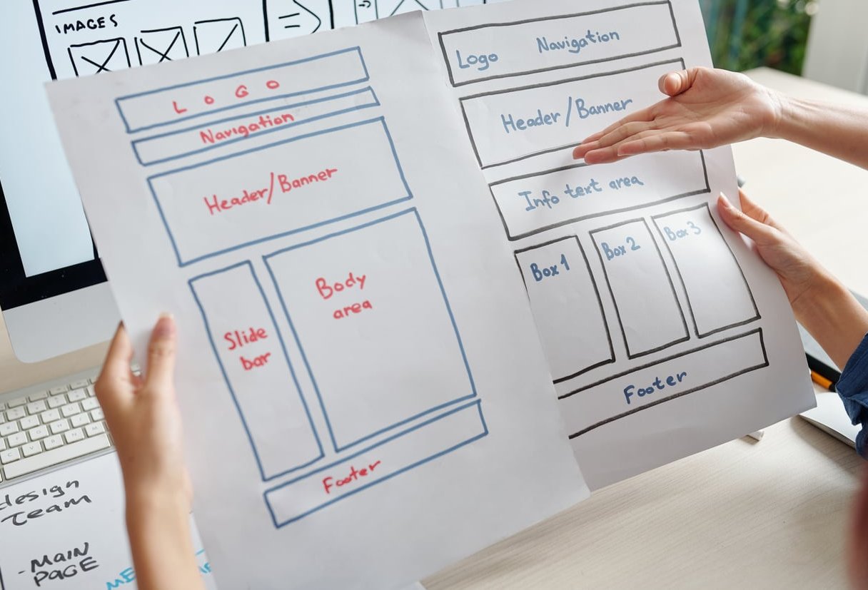
Quick Comparison of the 8 Layouts
| Layout | Best for | Columns / items | Trigger | Mobile fallback |
|---|---|---|---|---|
| Column-based | SaaS, B2B, services | 3 to 5 columns, max 8 links each | Hover + click | Accordion |
| Category grid | Feature-rich products | 6 to 9 tiles | Hover | Single-column list |
| Two-panel | Large ecommerce | 8 to 20 parents | Hover + keyboard | Drill-down |
| Featured content | Editorial, campaigns | 2 to 3 columns + 1 block | Hover | Drop the block |
| Image-led | Fashion, travel, food | 4 to 8 images | Click | Thumbnail list |
| Tabbed | Multi-audience sites | 2 to 4 tabs | Hover panel, click tabs | Flatten to sections |
| Full-width directory | Enterprise, education | 5 to 6 columns | Click | Full-screen drawer |
| Search-first hybrid | Docs, help centers, portals | Search + 6 to 10 links | Click | Search on top |
Hover vs Click: How to Decide
This is the single most argued-about detail in mega menu design, and the answer depends on panel size and content type.
Use hover when
- The panel is text-only and under roughly 400px tall
- Users browse rather than search (retail, catalog, resources)
- You can implement an open delay and a close delay properly
Use click when
- The panel is full-width or covers more than half the viewport
- It contains images, videos, or interactive elements like search
- The top-level item is also a real page users need to reach
- Your audience skews toward touch devices and hybrid laptops
Non-negotiable timing and behaviour rules
- Open delay: 150 to 250ms. Prevents panels flashing open as the cursor crosses the nav bar.
- Close delay: 300 to 500ms. Gives users room to move diagonally toward the panel without losing it.
- Safe triangle or invisible bridge. Keep the panel open when the pointer travels through the gap between trigger and panel.
- Escape closes it. Always. And focus returns to the trigger.
- Tab order follows visual order. Left to right, top to bottom, no exceptions.
- One panel open at a time. Opening a second closes the first, with no animation stacking.
- No hover-only access to anything. Every link must be reachable by keyboard and by tap.

Mobile Fallbacks That Don’t Break
A mega menu is a desktop pattern. On mobile it has to become something else, and this is where most implementations fall apart. Three fallbacks cover almost every case:
Accordion drawer
Best for 3 to 6 top-level items with shallow children. Full-screen or near-full-screen panel, categories as rows, tap to expand in place. Keep only one section open at a time so the page does not become an endless scroll. Add a clear close control in a fixed position.
Drill-down (slide-in) navigation
Best for deep catalogs. Tapping a category slides the next level in from the right. Requirements:
- A persistent back row showing the parent name, not just an arrow
- A separate “See all in [Category]” link at the top of each level
- Scroll position reset at each level, and restored when going back
Search-first drawer
Best for 300+ page sites. The drawer opens with the search field focused-ready (not auto-focused, which forces the keyboard up), then popular links, then full categories collapsed underneath.
Mobile checklist
- Tap targets at least 44x44px, with 8px minimum spacing between rows
- Nothing critical hidden behind a horizontal scroll without a visual affordance
- Menu opens without shifting page content (no layout jump)
- Body scroll locked while the drawer is open
- Works in landscape at 400px height
- Total menu markup does not balloon your initial payload; load deep levels on demand if the tree is huge
Content Rules Before Visual Rules
The most common reason a mega menu fails is not styling. It is unresolved information architecture pushed into a bigger container.
- Group by user goal, not org chart. “Solutions” and “Use Cases” as separate top items usually means two teams both wanted a slot.
- Cap total visible links at 60 to 70 per panel. Past that, scanning collapses regardless of layout.
- Write headings as nouns, links as specifics. “Integrations” as a heading, “Salesforce” and “HubSpot” as links, not “Learn about our integrations”.
- Front-load the label. Distinguishing words first: “Invoice templates”, not “Templates for invoices”.
- Order by demand, not alphabet, unless the list is a genuine directory people scan by name.
- Keep labels under 25 characters so nothing wraps to two lines and destroys the grid rhythm.

Accessibility and SEO Notes You Cannot Skip
- Use real
<a>elements with realhrefvalues. JavaScript-only navigation items are invisible to crawlers and painful for assistive technology. - Mark the trigger with
aria-expandedand toggle it correctly on open and close. - Use
<nav>with an accessible label, and headings or list semantics inside the panel so groups are announced. - Keep visible focus styles. Removing outlines to make the panel look cleaner is the most common accessibility regression in navigation work.
- Do not stuff every page into the menu for internal linking. A menu link that appears on every page distributes weight thinly and adds noise. Prioritise the 40 to 60 destinations that matter.
- Test with the panel content collapsed by default in the DOM: it should still be crawlable and expandable without a mouse.
A Simple Way to Pick Your Layout
- Count your real top-level categories. Fewer than 5 with shallow children: column-based. More than 8 with deep children: two-panel.
- Ask whether labels are self-explanatory. If not, you need a grid with descriptions or icons.
- Ask whether the product is visual. If yes, image-led. If no, resist the urge to add photos for decoration.
- Ask whether you have marketing content to push. If yes and someone owns updates, add a featured block. If nobody owns it, skip it.
- Check your analytics for search usage. High internal search volume means the search-first hybrid will outperform any browse layout.
- Prototype on mobile first, then expand upward. A menu designed desktop-first almost always needs a rebuild for small screens.

Testing Before You Ship
- Tree testing on your proposed structure with 20 to 30 participants before any pixels are drawn
- First-click testing on 5 to 8 common tasks: where do people go first?
- Keyboard-only run-through of every panel, top to bottom
- Screen reader pass on at least one panel of each layout type
- Post-launch checks: nav click distribution, menu open rate, search usage after a menu open (a spike means the menu failed the user)
Frequently Asked Questions
How many columns should a mega menu have?
Three to five on a standard desktop viewport. Four is the most reliable choice: it fills the width without cramping, and it maps well to a 12-column grid. Six columns only work in full-width directory layouts where labels are short.
Should a mega menu open on hover or on click?
Hover works for compact, text-only panels where users browse. Click is better for large panels, image-heavy panels, and anything containing a search field or form. Whatever you choose on desktop, mobile must always be tap-based, and keyboard users must be able to open the panel with Enter or Space. 15 Must-See Mega Menu Examples for 2025 is a useful companion to this.
Are mega menus bad for SEO?
No, when built with crawlable links and reasonable restraint. They help distribute internal links and clarify site structure. The risk is over-inclusion: dumping 200 links into the header dilutes relevance signals and clutters every page. Keep the menu to your priority destinations and let category pages handle the long tail.
What is the maximum number of links a mega menu should contain?
Aim for 60 to 70 visible links per panel as an upper bound, and far fewer if labels are long. If you exceed that, the right fix is a two-panel layout or a search-first entry point, not smaller type.
How do mega menus work on mobile?
They convert into one of three patterns: an accordion drawer for shallow structures, a drill-down slide-in for deep catalogs, or a search-first drawer for very large sites. The desktop panel itself should never be shown at mobile width, and any decorative featured blocks are the first content to remove.
Do mega menus slow down a site?
They can, if the panel loads dozens of images or duplicates a huge link tree in the markup on every page. Keep image assets lazy-loaded and correctly sized, keep the DOM lean, and load deep subcategory levels on demand when the tree is large.
Is a mega menu right for a small site?
Usually not. Below roughly 15 to 20 pages, a flat top navigation with 4 to 6 items performs better and looks more confident. A mega menu on a small site signals structure that does not exist and adds interaction cost for no gain. It is argued more carefully on unlimited-elements.com.
Final Takeaway
The best mega menu design examples share one trait: the layout matches the shape of the content. Column-based panels for grouped text, grids for features needing explanation, two-panel for deep catalogs, image-led for visual products, search-first for anything enormous. Fix the information architecture first, pick the layout that fits it, then set your trigger behaviour and mobile fallback deliberately rather than by default. Do that and the pattern quietly does its job: people find what they came for on the first try.